Some time ago, I started playing around with data analysis and machine learning. One of the more popular tools for such tasks is IPython Notebook, a browser-based interactive REPL shell based on IPython. Each session becomes a “notebook” that records the entire REPL session with both inputs and (cached) outputs, which can be saved and reviewed at a later time, or exported into another format like HTML. This capability, combined with matplotlib for plotting and pandas for slicing and dicing data makes this a handy tool for analyzing and visualizing data. To give you an idea of how useful this tool can be, take a look at some example notebooks using the online notebook viewer.
In this quick post, I’ll describe how I visualize binary features (present/not present) and clustering of such data. I am assuming that you already have experience with all of the above-mentioned libraries. For this example, I’ve extracted permissions (uses-permission) and features (uses-feature) used by a set of Android apps using Androguard. The resulting visualization looks like this:
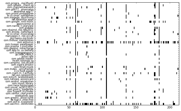
Each row represents one app and each column represents one feature. More specifically, each column represent whether a permission or feature is used by the app. Such a visualization makes it easy to see patterns, such as which permission or feature is more frequently used by apps (shown as downward streaks), or whether an app uses more or less features compared to other apps (which shows up as horizontal streaks).
While this may look relatively trivial, when the number of samples increase to thousands of apps, it becomes difficult to make sense of all the rows & columns in the data table by staring at it.
Loading the Data
The extraction script will use Androguard to parse the APK file’s manifest and extract the relevant information. If you’d like to play along at home, you can grab the script here. This information will be consolidated into a single CSV file, resulting in columns that look like the following:
_file: APK filenamep_android.permission.INTERNET: represents the use of theandroid.permission.INTERNETpermissionf_android.hardware.nfc: represents the requirement of NFC hardware feature
Metadata columns are prefixed with an underscore to make them easier to exclude using pandas. The generated CSV file can then be parsed by pandas into DataFrames in the IPython environment. Parsing the CSV file is easy:
dataset = pandas.read_csv('extracted_data.csv')
dataset.fillna(0, inplace=True)
Frequently-used Features
Notice from the visualization that a vertical line is formed somewhere after column 50 and again slightly after column 100. This indicates that that particular permission or feature is used in quite a few apps. You can show such columns by averaging each column, then sorting it by descending order:
dataset.mean().order(ascending=False)
This results in the following list, showing the most frequently occurring permissions or features:
p_android.permission.INTERNET                  0.925054
p_android.permission.ACCESS_NETWORK_STATE      0.850821
p_android.permission.WRITE_EXTERNAL_STORAGE    0.640971
p_android.permission.READ_PHONE_STATE          0.442541
p_android.permission.WAKE_LOCK                 0.344754
p_android.permission.ACCESS_WIFI_STATE         0.326196
p_android.permission.ACCESS_FINE_LOCATION      0.304069
p_android.permission.ACCESS_COARSE_LOCATION    0.292648
p_android.permission.VIBRATE                   0.278373
p_android.permission.GET_ACCOUNTS              0.229836
p_android.permission.RECEIVE_BOOT_COMPLETED    0.171306
...
Visualization
To produce the visualization of the dataset shown above, we use the matplotlib library.
To make the visualization more compact, columns that are all zeroes (i.e. not used by any apps) can be removed totally:
dataset = dataset.ix[:, (dataset != 0).any(axis=0)]
Basically the visualization is a heatmap but limited to binary values only (1 or 0). This can be done using matplotlib’s imshow, but non-binary columns should be removed from the dataset. The visualization code looks like this:
    fig, ax = plt.subplots()
    plt.yticks(dataset.index, dataset['_file'], fontsize='small')
    ax.imshow(dataset[[c for c in dataset.columns if c != '_file']],
        aspect='auto', cmap=plt.cm.gray_r, interpolation='none')
yticks() specifies the labels for each row (app). The index of the DataFrame should be in sequential order, otherwise you will need to use reset_index() to re-index the rows to make yticks() happy. The data to imshow() should exclude the _file column which holds the filename. This is done using list comprehension to form a list without _file.
The generated visualization should look similar to the figure above, except more dense.
Clustering
The previous visualization looks like a mess. We can use clustering algorithms from the scikit-learn library to try to automatically group the apps. For this example, we will use a bottom-up hierarchical clustering algorithm:
    X = dataset[[c for c in dataset.columns if not c.startswith('_')]]
    clustering = sklearn.cluster.AgglomerativeClustering(n_clusters=10)
    clustering.fit(X)
Note that for most clustering algorithms, the number of clusters (groups) must be manually specified. In this case, we are arbitrarily setting n_clusters=10. At the end of the clustering process, a label will be assigned to each app (or row). This label identifies which cluster a particular app belongs to. We can then associate these labels back to the apps in the DataFrame.
dataset['_label'] = pandas.DataFrame(clustering.labels_, index=dataset.index)
We then need to sort the DataFrame by this label column and re-index it to make sure the index in running order:
dataset.sort('_label', inplace=True)
dataset.reset_index(drop=True, inplace=True)
By adding lines and text annotations to the visualization code earlier, we can visualize how the apps have been separated into clusters:
    fig, ax = plt.subplots()
    fig.set_size_inches(fig.get_size_inches() * (2.5, 10))
    plt.yticks(dataset.index, dataset['_file'], fontsize='small')

    # visualize clusters
    for label, rows in dataset.groupby('_label').groups.iteritems():
        r = sorted(rows)
        start, end = r[0], r[-1]

        # separator line & text label
        ax.axhline(end + 0.5, lw=2, color='blue', alpha=0.4)
        ax.text(.4 * len(dataset.columns), start + .5 * (end - start), '%d' % label,
            fontsize=30, fontweight='bold', va='center', color='blue', alpha=0.3)

    ax.imshow(dataset[[c for c in dataset.columns if not c.startswith('_')]],
              aspect='auto', cmap=plt.cm.gray_r, interpolation='none')
Note that a multiplier is assigned to the figure size to make sure the visualization is of a proper size. The resulting visualization will then look like the following:
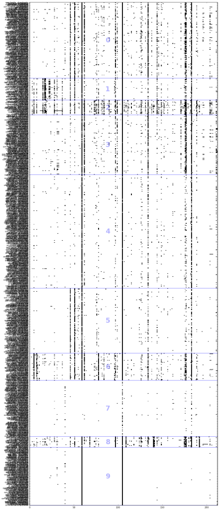
You can see from the visualization that the apps in group 7 has little or almost no permissions. Group 9 is almost similar, but utilizes the top 2 permissions, INTERNET and ACCESS_NETWORK_STATE.
The apps within each group can also be listed:
    for label, rows in dataset.groupby('_label').groups.iteritems():
        print 'Group %d' % label
        print dataset.ix[rows]['_file']
There doesn’t seem to be an obvious pattern in the grouping of these apps based on their permissions and features alone, but Group 2 contains a lot of social media or messaging apps such as:
- com.sina.weibo
- com.tencent.mm
- com.tencent.mobileqq
- com.kakao.talk
- com.fring
Coda
You can view the entire notebook for this post here rendered using nbviewer. I’m using data extracted from Android APKs as an illustration here, but you can analyze almost any type of data.
As humans, we can spot patterns more easily in visualizations as compared to staring at a table full of numbers. Hopefully this visualization technique will come in handy when looking at features across a large number of data rows.
