Some time ago, I started playing around with data analysis and machine learning. One of the more popular tools for such tasks is IPython Notebook, a browser-based interactive REPL shell based on IPython. Each session becomes a “notebook” that records the entire REPL session with both inputs and (cached) outputs, which can be saved and reviewed at a later time, or exported into another format like HTML. This capability, combined with matplotlib for plotting and pandas for slicing and dicing data makes this a handy tool for analyzing and visualizing data. To give you an idea of how useful this tool can be, take a look at some example notebooks using the online notebook viewer.
In this quick post, I’ll describe how I visualize binary features (present/not present) and clustering of such data. I am assuming that you already have experience with all of the above-mentioned libraries. For this example, I’ve extracted permissions (uses-permission) and features (uses-feature) used by a set of Android apps using Androguard. The resulting visualization looks like this:
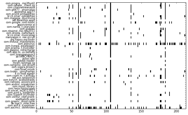
Each row represents one app and each column represents one feature. More specifically, each column represent whether a permission or feature is used by the app. Such a visualization makes it easy to see patterns, such as which permission or feature is more frequently used by apps (shown as downward streaks), or whether an app uses more or less features compared to other apps (which shows up as horizontal streaks).
While this may look relatively trivial, when the number of samples increase to thousands of apps, it becomes difficult to make sense of all the rows & columns in the data table by staring at it.
